
The Challenge —
The Stil founders set out to change the face of suncream. To challenge a stagnant mainstream suncare market. To stand out. Basically, to make people think again about what suncream is and what it could be.
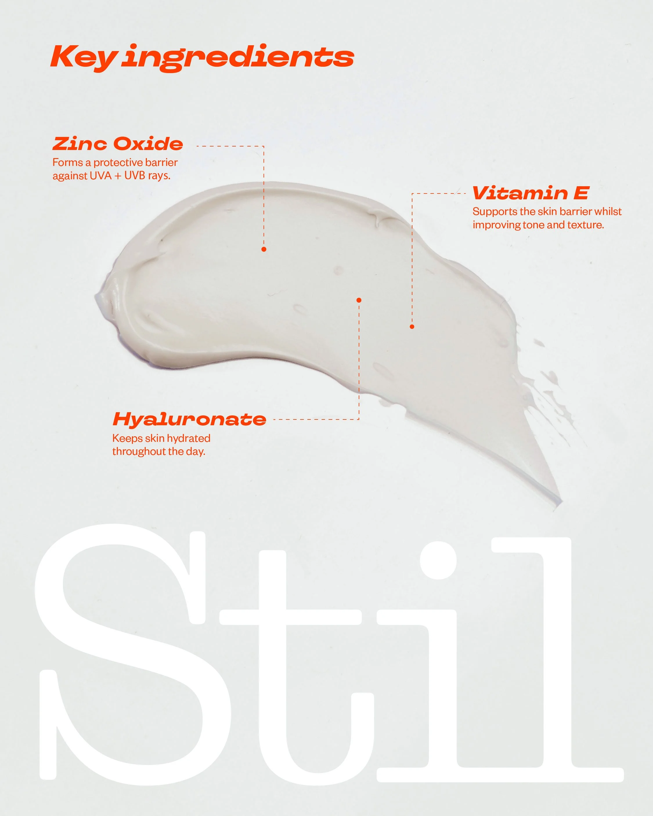
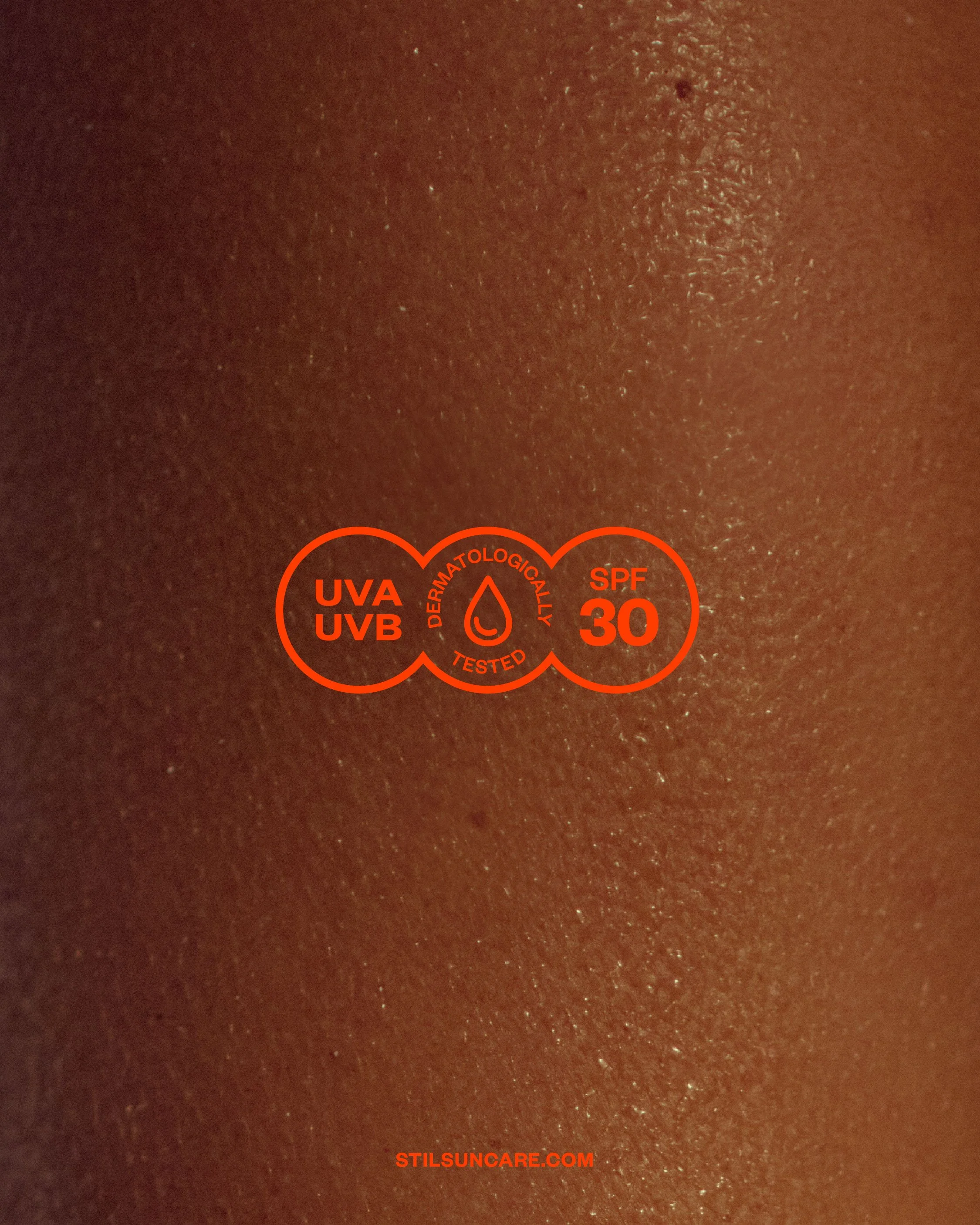
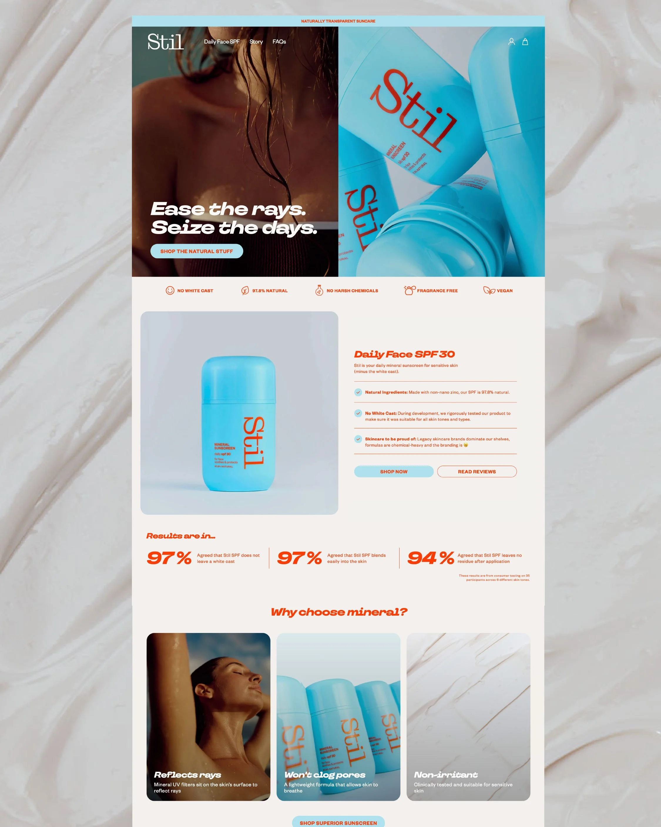
They were developing a mineral sunscreen that would not leave a visible white cast on the skin – with no harsh chemicals and over 97% natural ingredients.
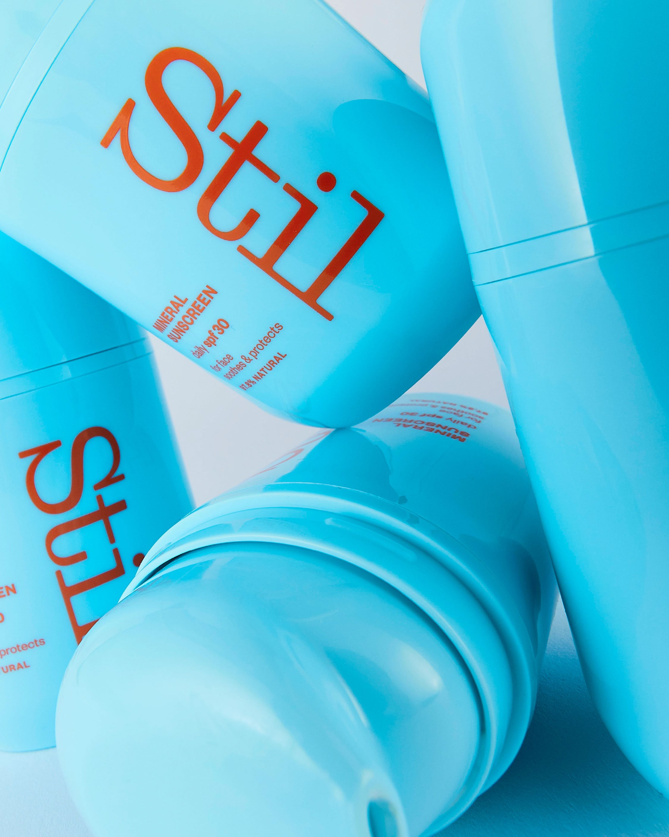
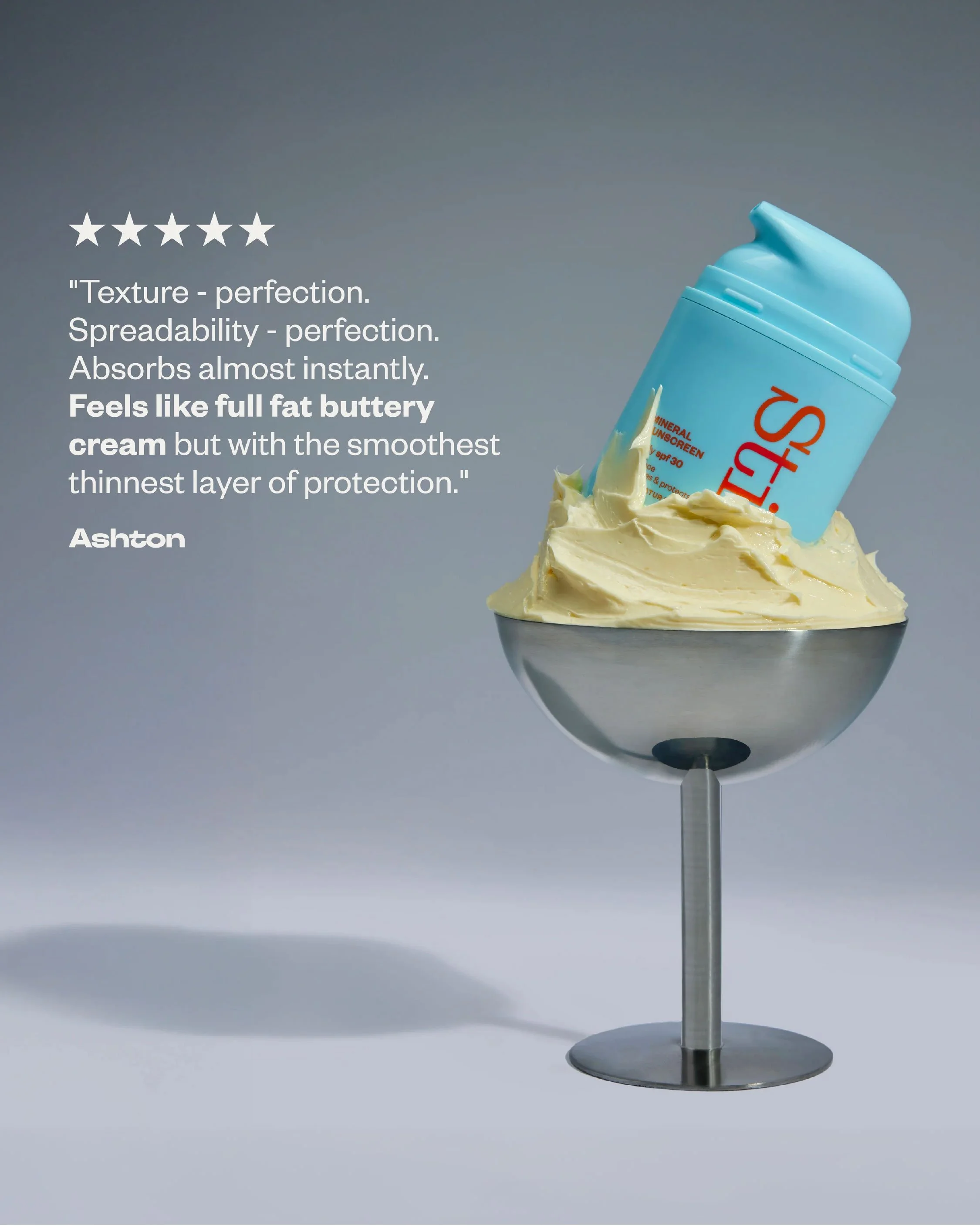
They needed a brand that would communicate all this, and at the same time be appealing, fresh, uplifting and bold. Plus, they wanted packaging that would leap off the shelf, and a brand voice to match.
Our Solution —
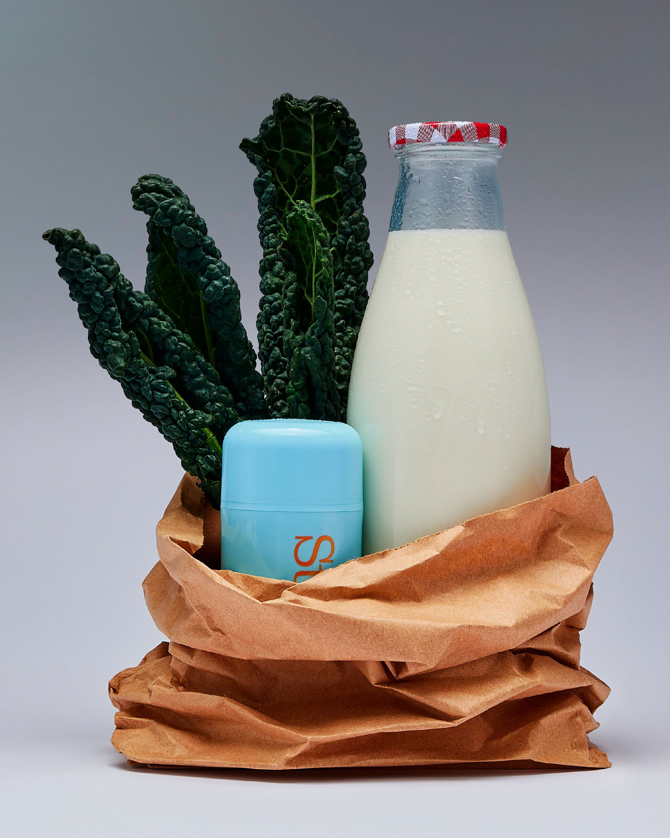
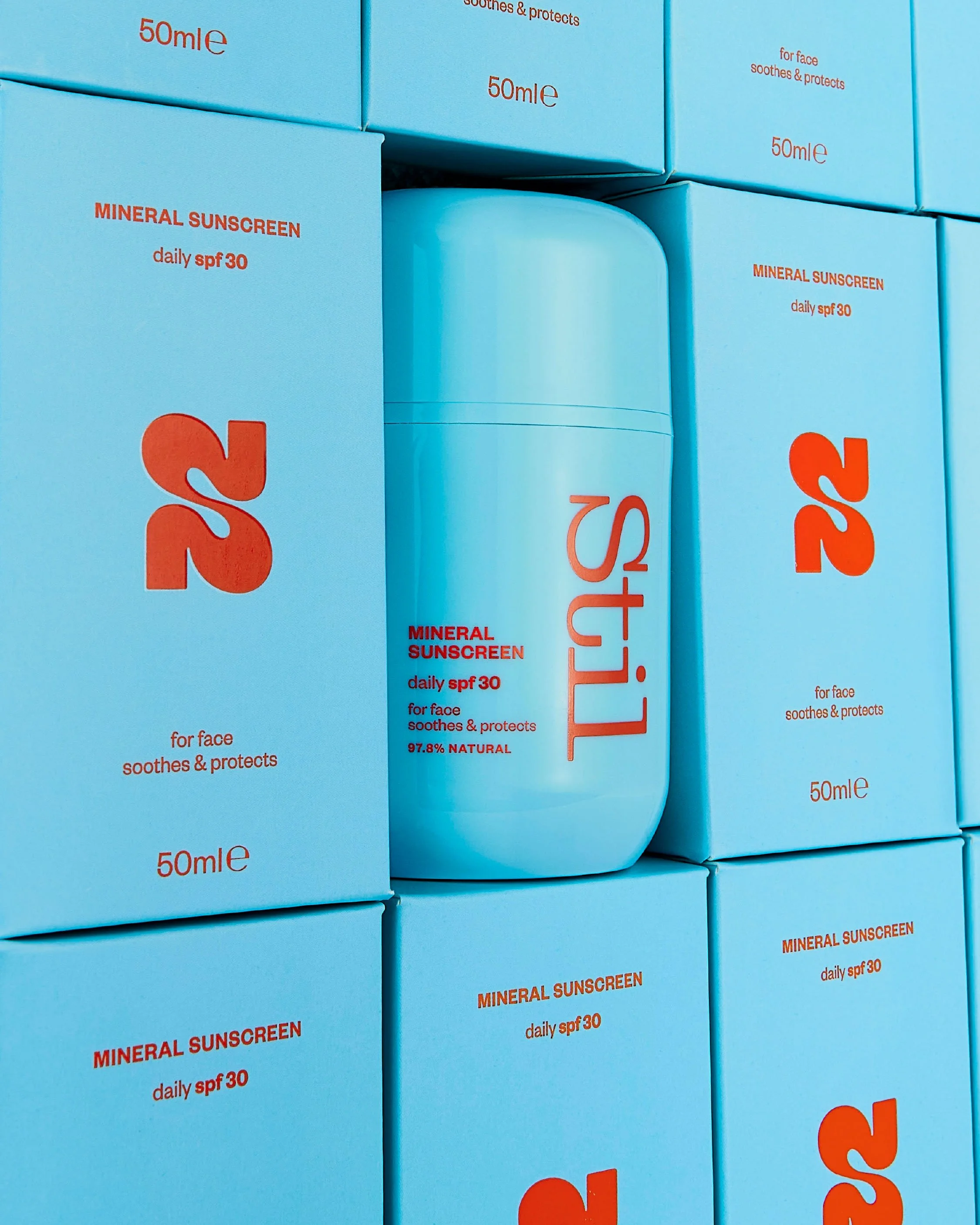
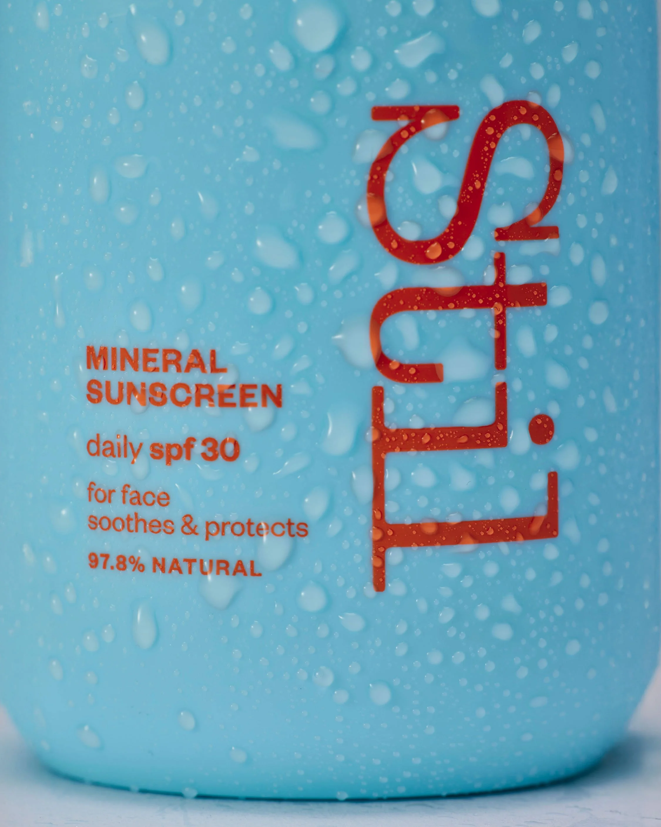
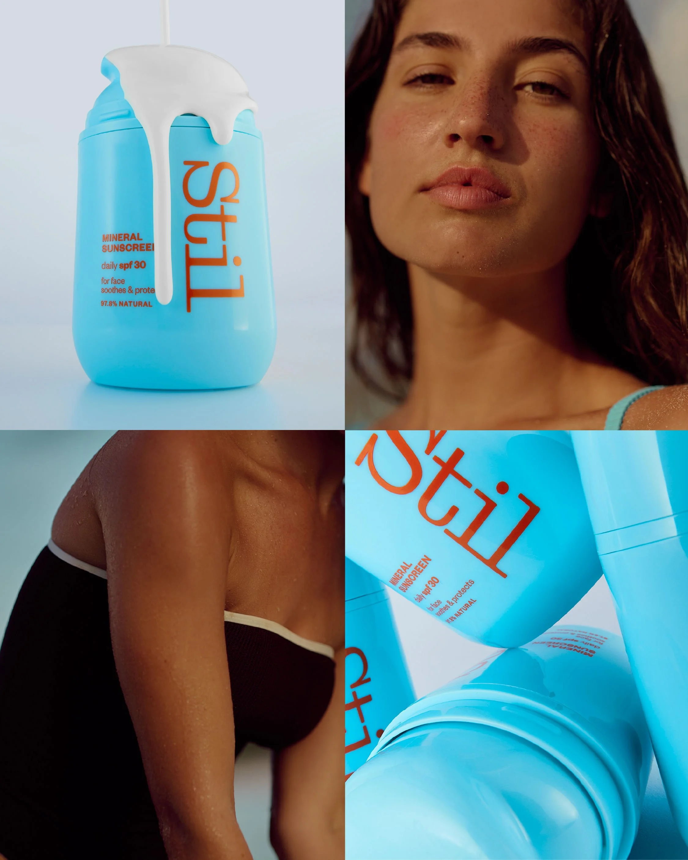
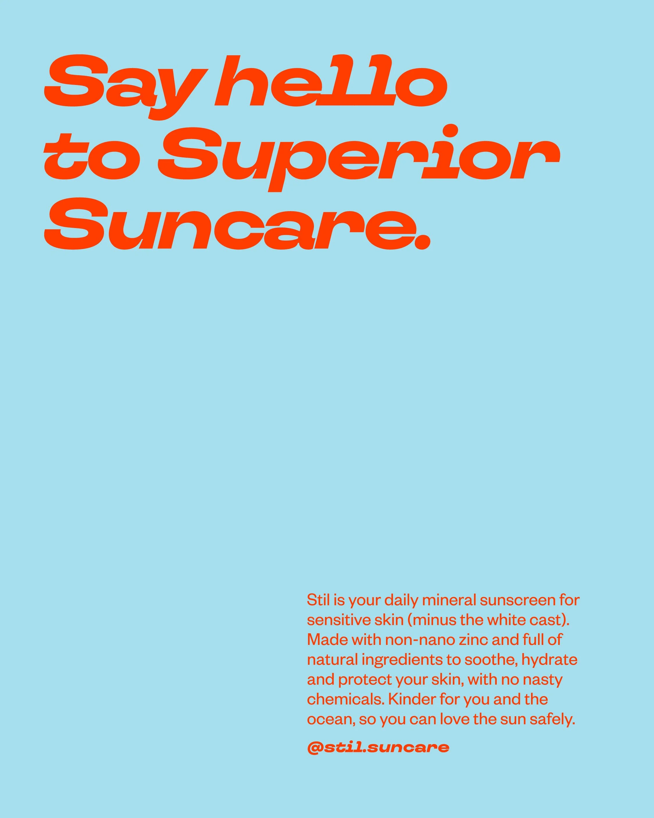
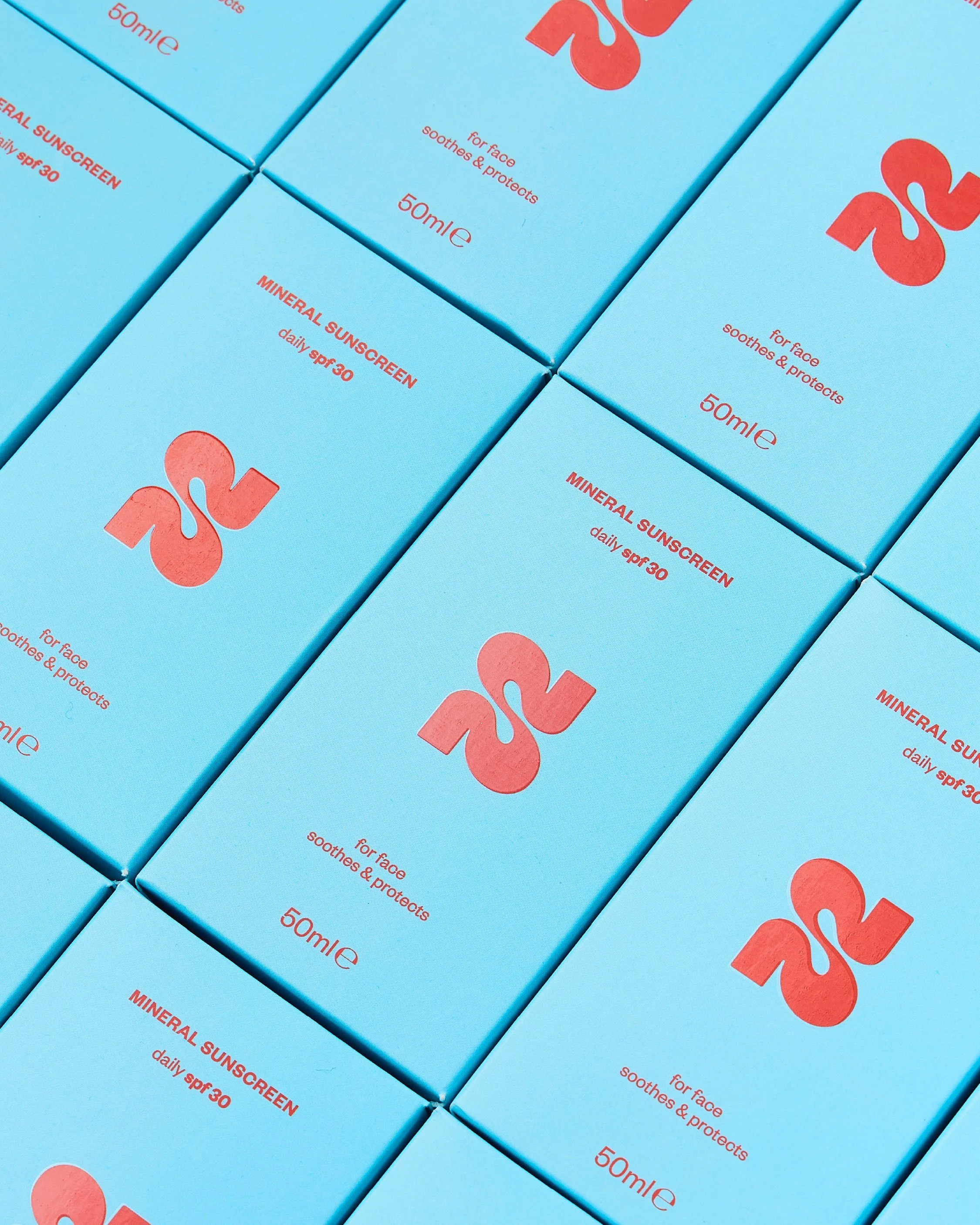
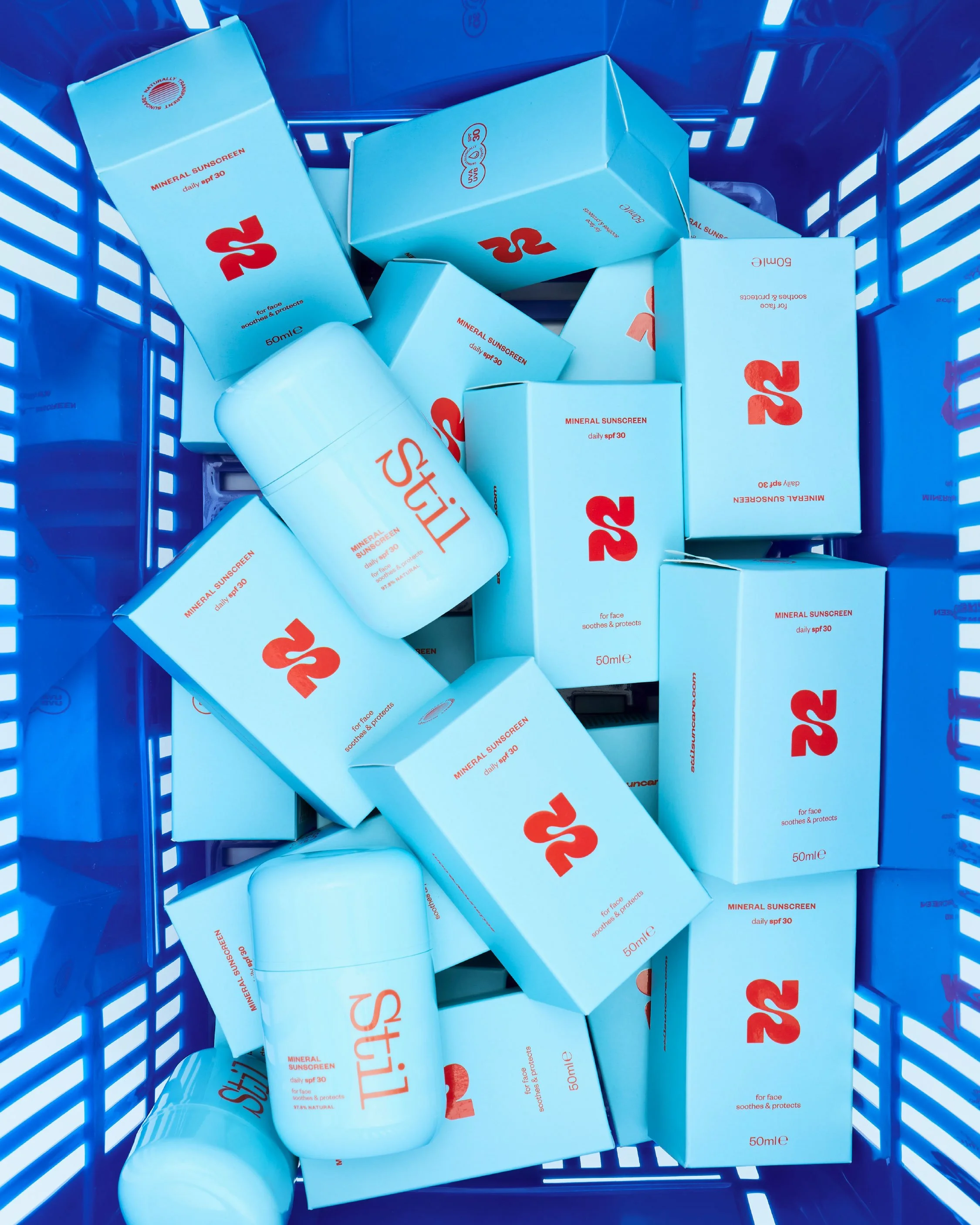
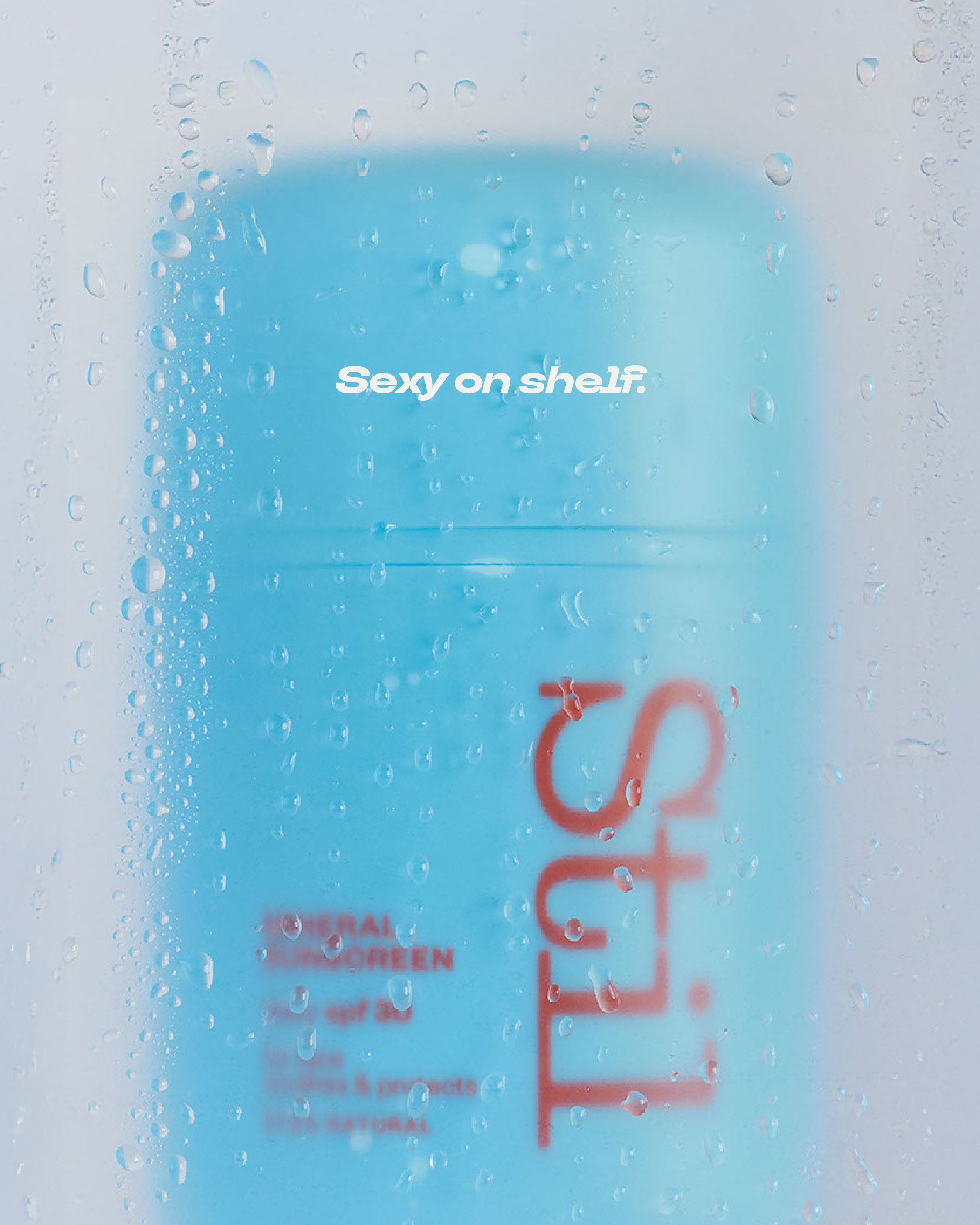
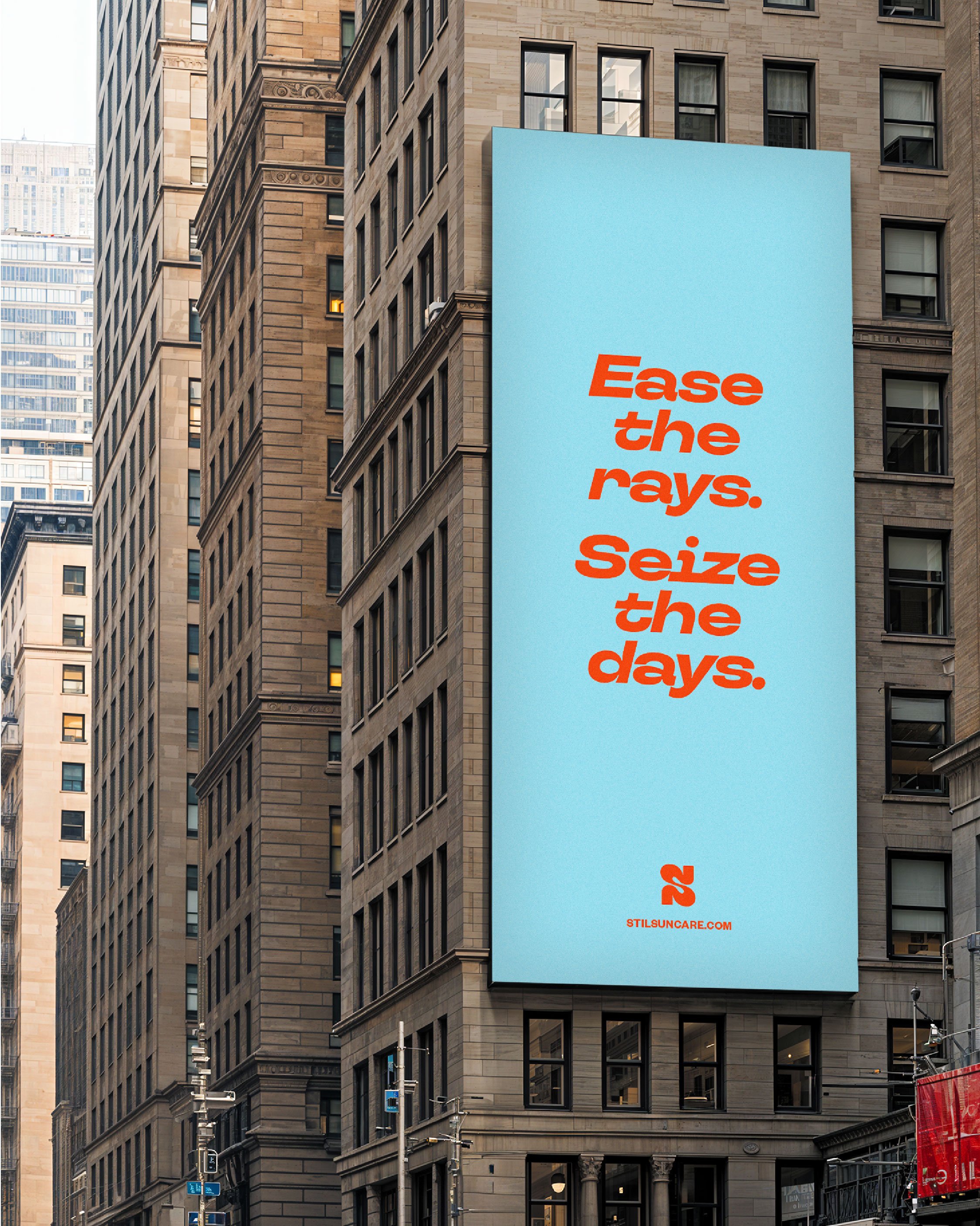
We developed a high impact colour palette and a tone of voice that was bold and uplifting, just like the sunscreen. We created packaging that was good enough to stand out on a shelf packed with hundreds of suncreams all in the same yellow-and-blue or orange-and-white packaging. You know the ones.
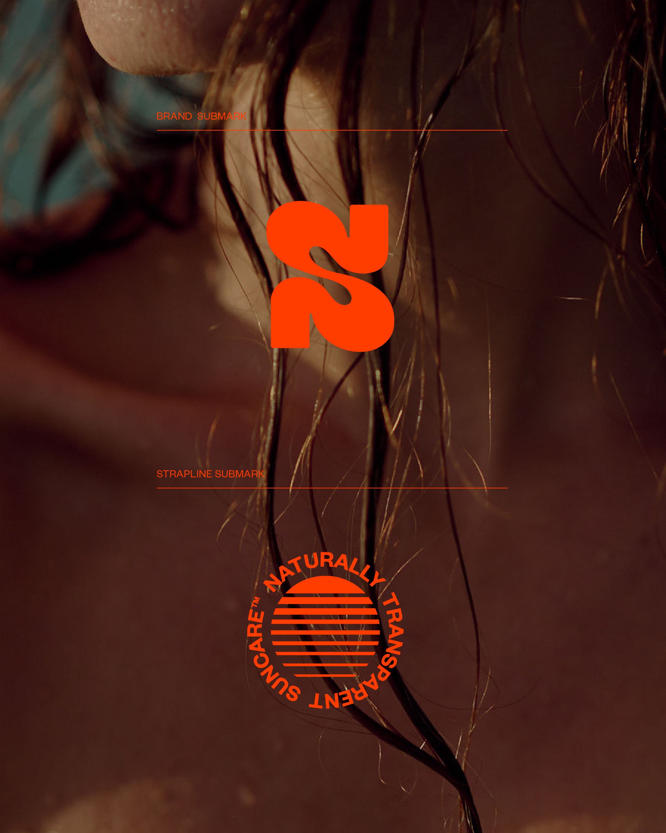
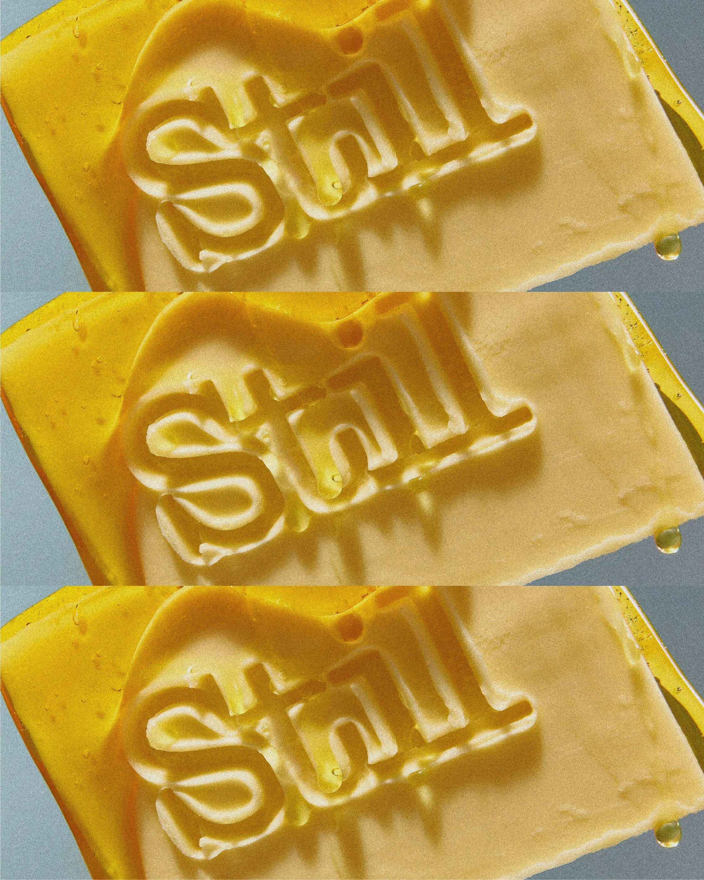
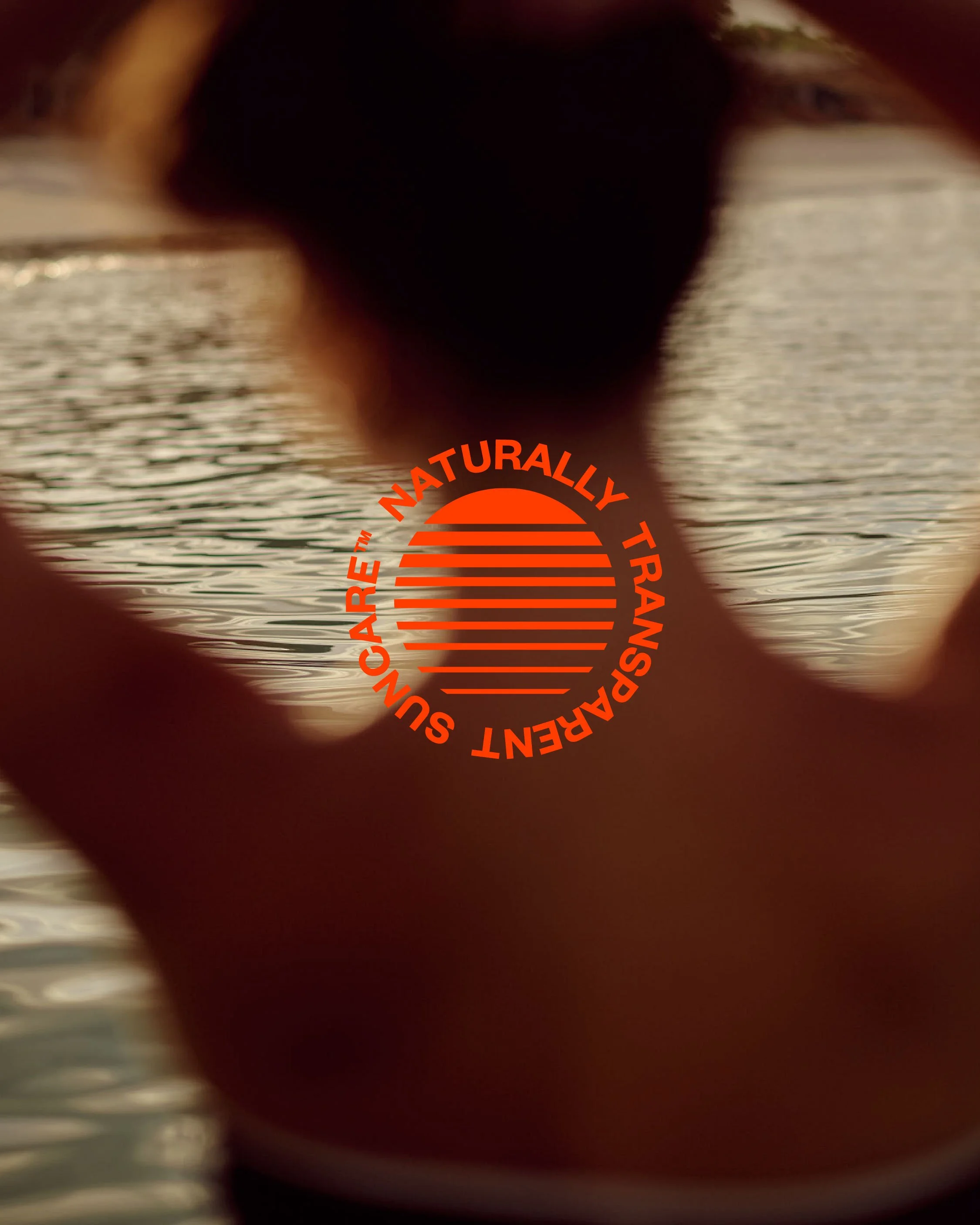
As part of the project, we developed several distinctive sub-marks including an S and a ‘setting sun’ icon. ‘Naturally transparent suncare’ and ‘Ease the rays, seize the days’ are key taglines that set the tone for the brand.
The result is a suncare range that cuts straight through the competition.

The Result —
Here’s what Tash Hagan, Stil’s founder, had to say about the result:
“They struck the perfect balance between bold and stylish while still feeling accessible to a wider audience. From the visual identity to our tone of voice, they hit the nail on the head every time. Laura and the team care deeply about what they do, and it shows in every detail.
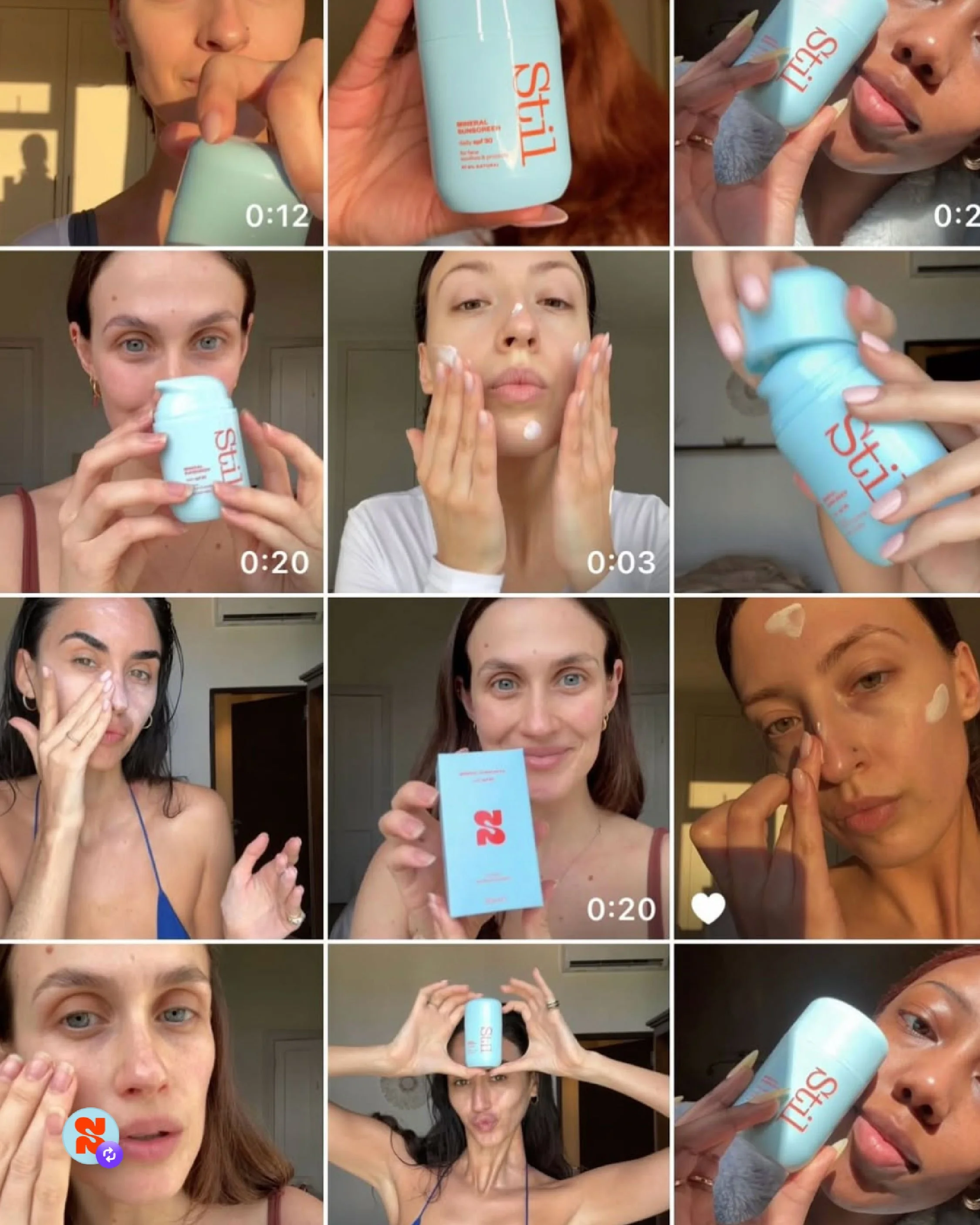
The packaging in particular has been a huge highlight – I get compliments on it all the time!
From the very beginning, Studio 25 have been incredible. They took the time to truly understand Stil, our customer and my vision for the brand. They worked through my thoughts and transformed them into a brand that feels elevated, timeless and completely authentic.”
Project Name
Project Name